


Overview
This short-term project focused on redesigning the Digital Workplace (DWP) newsletter template, which are primarily used to share IT infrastructure-related updates within Boehringer Ingelheim (BI) company. The goal was to create a fresh, visually engaging, and user-friendly design aligned with the company’s new corporate branding themes. The redesign aimed to improve employee engagement, particularly for critical updates, ensuring key messages resonate with the audience.
Objectives
The goal of the project was to evaluate how employees interact with the Digital Workplace Newsletter, assess its usability, and identify pain points and improvement opportunities to enhance user satisfaction and engagement.
Methodologies
-
In-depth Interviews.
-
Usability Testing (two Moderated sessions).
-
Affinity mapping and pain-points finding.
-
How Might We (HMW) technique for ideation.
UX Plan Overview
Empathy & Define
Ideate & Design
Stage 1
Stage 2
Goal:
-
Understand business goals.
-
Identify user’s needs and pain points.
-
Assess users interaction/comprehension level of the current version of templates.
-
Define ideation techniques based on user’s pain points for the next step.
Goal:
-
Reach the best inclusive solution aligned with user’s needs and corporate brand.
-
Implement the selected idea(s) and transform them from paper to digital version in order to test preparation.
Stage 3
Test & Iterate
Goal:
-
Evaluate the new design to identify how easy users can accomplish core tasks.
-
Understand the probable issues in the user flow and the design elements, and modify them.
-
Inform stakeholders for decision making.
Problem Statement
The Digital Workplace newsletter template require redesign to better align with the corporate branding, user’s needs and usability principles.

Stakeholders Key points

-
Retain language tabs for multinational users
-
Ensure prominent visibility of company and DWP logos
-
Align with corporate branding
-
Make the design mobile-friendly and include a dark mode option
-
Use modern, lightweight graphics
-
Present IT topics in an engaging format
Evaluated Version
Header
Footer


Language tab
Sections
Usability Test
After understanding the stakeholders' perspective, we conducted a usability test on the latest edition to evaluate usability, gauge user awareness, and identify pain points and improvement opportunities.


We prioritized users issues in the touchpoint board
User's Issues
Issues
Different button colors were confusing for the users
Users could not distinguish between different sections easily – Too much texts
Users found polygons old-fashioned in the footer
Users did not notice the language tab since it does not look like clickable buttons, and colors, contrast and shape of the buttons are not accessible
Users found the old-fashioned design and unrecognizable banner made the newsletter hard to identify for them
UX Recommendations
Place the language tab in most noticeable spot and use better contrast and brand-aligned colors and shapes
Use distinct, brand-aligned illustrations for the banner as well as more highlighted logo and title for it
Simplify the design, use brand illustrations and promote our channels instead
Design a version without buttons, and test with users to check the click through rate
Use two high-contrast colors for the background and text container to ensure accessibility – Text reduction

Development Constraints
Since the monthly newsletter is sent via Outlook, developers highlighted key constraints specific to Outlook mail clients:


-
Dynamic elements like dropdowns and responsive buttons/images are not supported
-
Text on images is unsupported
-
Dark mode depends on the device version, with older devices unable to distinguish between modes.
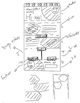
Ideation
After meeting with the development team, we initiated ideation sessions using "How Might We" techniques, following a mobile-first approach to meet user and stakeholder preferences. This led to the creation of the following sketches.


Corporate Brand
One key objective and stakeholder requirement was to adhere to the new corporate branding principles.
An overview on part of Boehringer Figma design system

Our approach to the GOAL
Following multiple design sprints with UX team and stakeholder reviews, we finalized the design and prepared it for usability testing. To ensure a thorough evaluation, we tested the design on the smallest mobile screen available in Figma (iPhone SE), focusing on usability and user experience.


-
A high-contrast banner was designed to enhance visibility and improve accessibility.
-
Language tabs were repositioned for prominence, with improved contrast and button design.
-
Unnecessary buttons were removed to streamline the interface and create a cleaner design.
-
The design elements were better aligned with the corporate brand.
-
Call-to-action buttons were replaced with responsive links to simplify the interface and create a cleaner design.
-
Text was reduced to simplify the design, enhancing usability and focusing on key elements.
-
Channel icons were emphasized with better-shaped buttons for improved size and visibility.
-
Polygons were removed to highlight our channel icons.
Usability Test - Users Insights
-
Language Tab:
Users easily noticed it in the first sight, and it was understandable for them
-
Sections:
Most of the users could easily separate different sections and they liked the white background for the texts (explanations)

-
Header/Banner:
Users found it interesting. The only concern addressed by users is to make the DWP logo bigger
-
Title/Buttons:
Users quickly found the clickable titles and could distinguish between those

-
Time Estimation:
Users found it useful since they know how long this article will take and they can decide if they want to read it now or later
-
Images/Icons:
Users found images and icons adequate, intuitive and relevant, but a little small

-
Learning Materials card with titles:
Users easily perceive each card, and they mostly mentioned that titles for each card are very helpful if those are self-explanatory in all editions
-
Footer:
Users found it clean, clear and better aligned with the corporate brand. The only concern mentioned by some users was about the advertisement links icons and texts size which need to be bigger to grab the user’s attention more

Design Iteration
After gathering user insights from testing, we iterated the design to address feedback, making it more user-friendly and seamless.
Header:
Make the DWP Logo and Newsletter title bigger aligned with corporate brand dimensions guideline


Tested
Iterated


Images/Icons/Texts:
Make the images/icons and explanation texts bigger in order to achieve more accessible design for the users.
Tested
Iterated


Footer Links:
Make the advertisement links, icons and texts size bigger in order to achieve more accessible design for the users.
Tested
Iterated
Impact Measurement
After nearly two months, we analyzed data from the first redesigned edition, sent to all employees on January:

CTR Improvement : ~40% Increase
2024
2025
Click-Through Rate (%)
January
Whole Year
5.05%
7.07%
+40%
-
The average click-through rate (CTR) for 2024 was 5.05%.
-
The redesigned edition achieved a 7.07% (CTR), reflecting a significant increase in user engagement.

Steps Taken
-
Handover of the final design to the development team for implementation.
-
Conducted post-implementation testing to validate functionality and usability.
-
Delivered a comprehensive final report to stakeholders, detailing the updates and next steps.
-
Scheduled a post-launch analysis after the first month to evaluate the redesign's impact and effectiveness.
Lessons Learnt
-
Collaborate with teams and stakeholders early to ensure alignment.
-
Engage corporate branding teams to avoid design inconsistencies.
-
Involve developers from the start to address technical constraints.
-
Use regular usability testing to refine the design.
-
Focus on a mobile-first approach for better accessibility and user experience.