


Project Brief:
Floy’all is a digital flower catalogue catering to the suburbs of Barcelona. It offers fresh flowers and plants with distinctive arrangements, ensuring quick and interactive delivery. The platform targets residents who lack the time or ability to visit physical stores, including those looking to surprise loved ones with personalized floral designs.
Project duration:
August 2022 to February 2023
Problem:
Busy users often lack the time to visit flower shops and distrust online alternatives due to uncertainty in quality and service. Floy’all addresses this by offering a seamless, transparent experience, ensuring confidence from selection to delivery.
Goal:
To deliver a seamless, transparent floral shopping experience with unique arrangements and fast delivery, ensuring busy users in Barcelona’s suburbs can trust and easily order flowers online.
User research:

Questionnaires


Empathy map

User research: summary
I conducted qualitative research and interviews, and also created empathy maps to understand the users I’m designing for and their needs. A primary user group identified through research was working adults who don’t have time to go and buy flower at the store.
This user group confirmed the initial assumptions about Floy’all customers, but research also revealed that time was not the only factor limiting users from going and buying flower at the store. Other user issues include distance, overcrowding in flower shops, florist communication skills, and difficulties getting florists to grasp genuine consumers' desires and create the precise item they want.
User research: pain point
Time
Working adults usually are too busy to go to store and buy flowers
Real experience
Some users would love to feel the real flower-buying experience at the store and check the flower conditions tangibly.
Wrong item
The majority of the time, flower-buying platforms do not supply completely similar items, and many customers complain that their orders and the final products they receive differ greatly.
Accessibility
Flower-buying platforms are not equipped with assistive technologies.
Personas:
Problem statement
Mory is a very busy person at his work who needs an easier, faster, more efficient and more reliable way to buy flower for his partner in his routine life because he has no enough time to buy flower at the store.


User journey map:
Mapping Mory’s user journey revealed how helpful it would be for users to have access to a dedicated Floy’all platform (app or the website).

User flow:
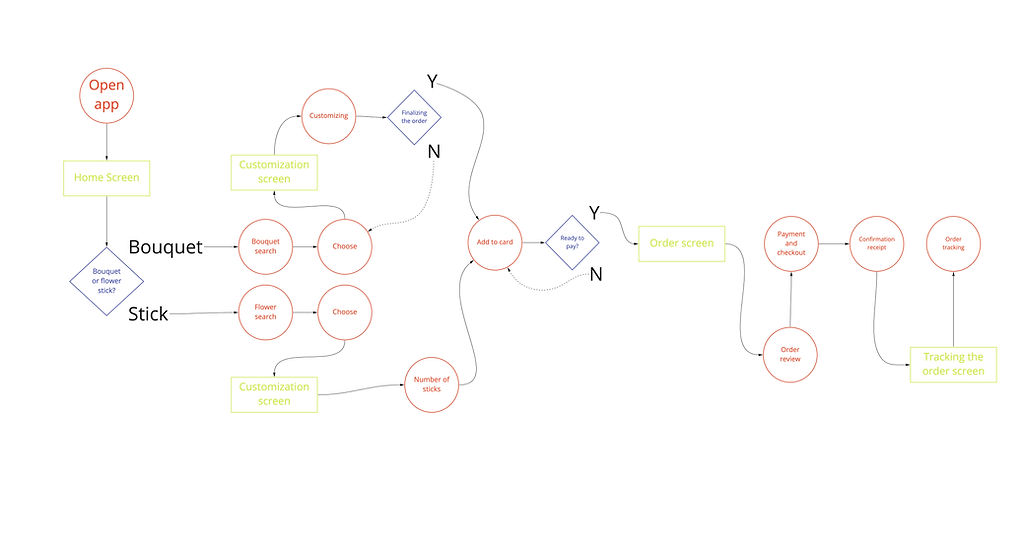.jpg)
Paper wireframes:
I collaborated with product management, development, and marketing teams to align the design with user needs and business goals. By starting with paper sketches, we could quickly iterate on layouts and refine the user flow before moving to digital wireframes.
For the home screen, I focused on key UX principles, such as ease of navigation and time-saving features. The "Best Sellers" section was added to help users quickly find popular products, improving the user experience and reducing decision fatigue. This approach ensured the design was user-friendly and aligned with business objectives.

Digital wireframes:
-
As the first design process progressed, I made a point of basing screen designs on user research input and findings.
Different categories in order to help users find their desired product faster
Considering best seller section due to help users find their desired options faster

Consultation with experts in order to make process more interactive and also professional

Being able to preview the ordered flower/bouquet/plant make the process more transparent and reliable.
-
Transparency and identically was one of the key user needs to address in the designs which was tried to meet it by designing a 360 degree image/preview.
Low-fidelity prototype:
The low-fidelity prototype connects the key user flow of customizing, previewing, and ordering a flower bouquet/plant, allowing it to be utilized in a user usability research.

View the Floy’all lo-fi prototype: https://www.figma.com/file/8IbG7tKegNo6KxvRAu93OV/Floyal-(flower-catalogue)?node-id=0%3A1&t=QqlBhivZz6Eb0kTi-1
Usability study: findings
I carried out two rounds of usability study. The initial study's findings aided in the design process, from wireframes to mockups which was carried out through unmoderated methodology. The second research made use of a high-fidelity prototype to indicate which areas of the mockups needed to be improved and has been accomplished through the moderated methodology by online sessions.


Finding round 1
1) Users wants to see billing information before set the payment method.
2) Users need a short explanations/more info. and better cues in chat screen and also consultation section(s).
3) Users want a delivery option.
Finding round 2
1) Search screen with both in-app and general search options
2) Having first delivery and then payment screen
3) Call option is not convenient at this point of the project
Design system:

Mockups:
-
The initial design included in-store consultations with experts. Based on usability study feedback, I worked with the product, development, and customer support teams to shift to an online chat feature for better accessibility and convenience.
-
Collaborated with the development team to transform the bottom navigation bar into a side nav-bar, improving accessibility and streamlining navigation.
-
The changes were made in alignment with cross-team insights, ensuring the solutions addressed user needs while being technically feasible.
Before usability study 1
After usability study 1


The second usability study revealed some issues with the side navigation bar and also the online chat section below the home screen. To streamline these two flows, firstly I use the interactive and accessible buttons instead of side nav-bar and also use a chat button in order to make online consultation option more accessible and interactive throughout the journey and also I added two different practical sections called “recommended products” and “economical deals”.
Before usability study 2

After usability study 2

Our approach to the GOAL:
-
Clear Goal:
Deliver a transparent, trustworthy platform for fast, customizable flower delivery.
-
Iterative Enhancements:
-
Streamlined navigation and enhanced online chat accessibility.
-
Added “Recommended Products” and “Economical Deals” sections based on usability feedback.
-
-
Trust-Building Measure:
After sprint sessions and design critiques we Introduced a confirmation step for users to review and refine their orders through call or message.
-
Outcome:
A seamless, user-centric experience that reaffirms our commitment to the project’s goal.


High-fidelity prototype:
The primary high-fidelity prototype demonstrated smoother user flows for browsing desired flower options, customizing them, and previewing the order before delivery. It also satisfied user requirements for delivery options and payment section priority.

View the Floy’all hi-fi prototype: https://www.figma.com/file/8IbG7tKegNo6KxvRAu93OV/Floyal-(flower-catalogue)?node-id=1283%3A5789&t=QqlBhivZz6Eb0kTi-1
Accessibility considerations:
Use WCAG throughout all stages of the design process and for all parts of the final product
To help consumers better comprehend the designs, detailed imagery was used for flowers/bouquets/pots, as well as in the customizing and waiting for confirmation pages.
Making navigating simpler by using icons


Floy’all hi-fi prototype presentation:
Takeaways:
Impact:
Enhanced user flow clarity and transparency, driving a 20% increase in user engagement and customer trust.
A quote from user feedback:
"Different user experiences in the app are really simple, and it's a lot of fun to personalize and construct my own flower bouquet/pots! I would absolutely use this app as a quick, dependable, and entertaining substitute for a flower shop."
What I learned:
While building the Floy'all app, I discovered that the first app concepts are merely the beginning of the process. Usability tests and user input informed each version of the app's design, demonstrating that the design process is iterative and dynamic.
Next steps:
We've conducted additional usability tests to confirm that the users' problems have been adequately addressed and resolved.
In order to make the process more reliable and practical, we've provided extra options/features, such as an optional videocall in the waiting for confirmation step.
We've conducted further user research to identify any new areas of need.
Software used in this project:
If you would like to view the responsive web design of Floy’all, please feel free to reach out to schedule a brief call.